The Value of Looking Different
Bidlo has reimagined its brand to break free from industry misconceptions and sharpen its focus on what truly matters: helping contractors bid smarter and faster on public work. Discover why our new, minimal look isn’t just a cosmetic change—it’s a statement of intent.

Alex Desai
One of the strangest problems a startup can face is being mistaken for something it’s not. It might sound trivial—just explain what you do, right? But sometimes, branding quietly files you under “just another one of those,” and once you’re misfiled, it’s surprisingly hard to escape that label.
That’s exactly what happened to Bidlo. If you haven’t heard of us, we build software to help contractors bid faster and more profitably on public work—a complex, high-stakes process that, we believe, should be more data-driven. Yet for the longest time, prospects lumped us in with standard construction-management or estimating tools. We’d hear on calls:
“Oh, I didn’t realize you did that.”
“So, you’re not just an estimating software?”
“This is a lot better than my spreadsheets.”
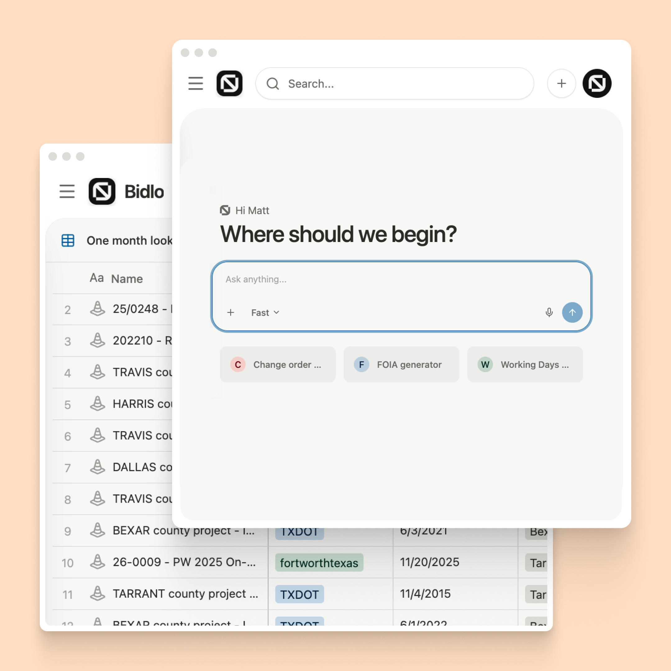
The problem wasn’t explaining Bidlo; it was the branding. Our old design followed the industry playbook: friendly colors, familiar interface, cheerful graphics. It felt safe, but it also made us look like everyone else. If you’re busy, you see that design and think, “Just another tool.” It overshadowed the fact that Bidlo is fundamentally different—an AI-driven platform that collects and analyzes bidding data at a scale estimator’s have never seen.
Here you have a product that actually thinks—surfacing actionable insights and identifying opportunities more intelligently than any spreadsheet or estimating software template.
So, as Bidlo begins a bottom up rebuild of its platform—where we’re rebuilding Bidlo to focus more on Smart Widgets and AI—we’re taking the opportunity to fix our branding mistake as well. We’re stripping away the clutter. Our new design feels almost alien in its minimalism, but that’s on purpose. Instead of friendly ornamentation, we’re focusing on clarity and performance.
We’re not like existing software. People keep comparing us to HCSS, B2W, Salesforce or even Excel. We’re none of those. Bidlo is a software that thinks, using AI to surface insights at scale — something our industry has never seen before.
Minimalism speeds development and performance. Fewer colors, fonts, and flourishes help us rapidly iterate on widgets and features without design bloat. Better yet, these changes greatly improve site speed and performance — keeping users in their flow state.
Less noise puts the focus on content. With distractions stripped out, we can show more meaningful data on screen. That matters as we begin rolling out our new widgets and custom layouts — surfacing the right information at the right time.
When you change how you look, you’re also admitting something deeper has changed. Over the last 6 months, we’ve stripped out features that didn’t matter, doubled down on what does, and grown confident in our understanding of what customers really need. For us, that means focusing on data-driven bidding—without the extra noise.
In the end, the most important thing about a brand is honesty. We’re not trying to look like a friendly knockoff of existing tools. We’re not. We’re pushing bidding technology forward, and looking different isn’t just a design choice—it’s a necessity. Once you see Bidlo’s new design, you’ll know right away: this isn’t just another construction software. It’s something fundamentally new.